Ad Design | John Pomp
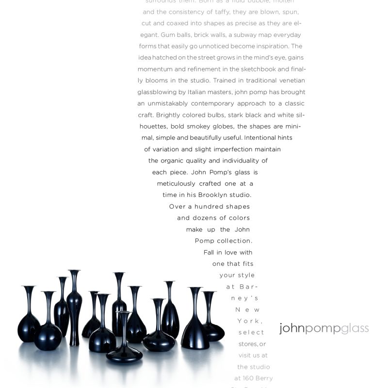
Basically when you’re working with forms as aesthetic and elegant as John Pomp’s glass vessels you’re already ahead of the curve. We did want to add something to it but not overdo it. We used the negative space to play on the way the vessels sit next to each other… we kept the copy straight, lighthearted and direct which is exactly what you’d get from John.


