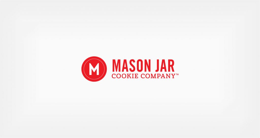
Identity | Mason Jar Cookie Company
Mix it up… that’s what you do with Mason Jar Cookie Company’s all-in-a-jar mixes and that’s what we did with their logo. We mixed a heavy sans serif with a lighter more craft oriented serif face. Simple enough to work in small spaces (like the kind on jar labels) and strong the circle M icon slyly mirrors the lid of a mason jar without clobbering you with country cute. It took a few goes to get the recipe right, but it’s turned out pretty tasty.


